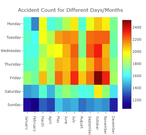
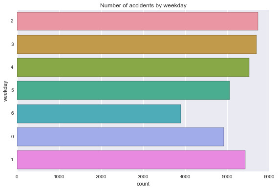
How we found correlations between features and accidents
Heatmap correltion between the day and month compared with number of accdients
Heatmap correltion between the time of day and day compared with number of accdients

Bar chart showing the correlation between the day of the week and the number of accidents
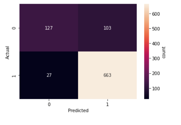
Our final confusion matrix for our distracted driver cnn classifier
As you can see there are very few times when we predict the driver is attentive and they actually aren't. We
have much more false positives,
where the driver is attentive, but we classify them as distracted.
This is better as we would rather be safe than sorry.